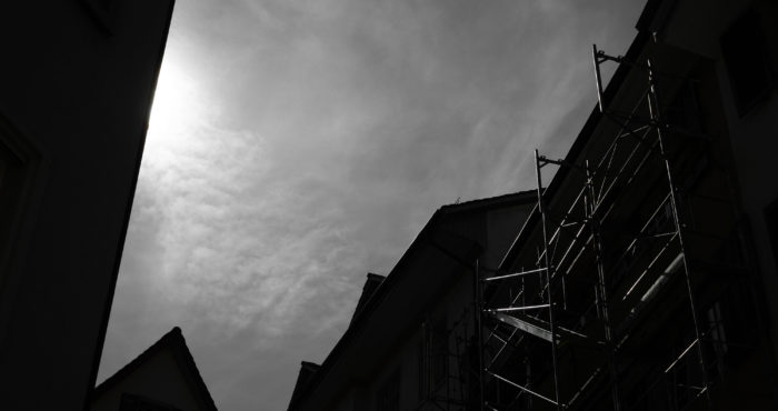
Here is the making of another image no one loves – at least it seems like that! – but me. It is one of my favourites.
In one of my previous posts I started my series ‘favourite #[number]. no one loves – but me’, which shows the making of one of my much beloved, but rather “difficult” images – “difficult” in terms of “no one loves” or better “not pleasing everybody” – but nevertheless beeing one of my favourites. For me it is essential to have my own photographic style – my images do not have to please everybody.
This image was taken at July-18 2018 in Baden – a beautiful Swiss old town a couple of miles away from my home. Wandering around, throught the narrow alleyways near the Löwenbrunnen I was heading to the St. Niklausstiege, where I wanted to have a look at the steep steps up to the Schlossruine Stein – please see this Google Map Link for all those locations. Just in front of the stairs I spotted the strong contrasts on a scaffold – constructing machinery everywhere – I’d rather be very careful not to disturb the ongoing renovation work and not to set up the workmen!
I wanted to catch the strong reflections on the scaffold contrasting the dark buildings, making a beautiful silhouette to the sky, and all in direct backlight. I had a clear vision of the final image I wanted.
I took only a couple of photos, waiting for the right moment, when no workman was on the scaffold.
The original file
This is the original file, without any corrections, straight out of the camera.

Original .DNG SOOC, converted to .jpg without any corrections.
Technical details
As always I was using simple and minimal gear: My Ricoh GR II, GR Lens f=18.3 mm 1:2.8. ISO 100, 1/1000 s, at f8, shot in .DNG RAW format.
Editing in Adobe Photoshop Lightroom
After importing the file in Adobe Photoshop Lightroom I made some basic corrections.
Lens corrections basic
– Enable Profile Corrections: enabled
btw: Thank you @Michael Kowalczyk Photography for creating the geometric Lens Correction Profile File for the RICOH GR I & II and for publishing it – thank you!
– Remove Chromatic Aberration: enabled
– Constrain Crop: enabled, this resulted in a slight crop.
Lens corrections manual
– Distortion: 0
– Vertical: -20
– Horizontal: 0
– Rotate: 0.0
– Scale: 100
– Aspect: 0
Sharpening Details:
– Amount: 25
– Radius: 0.5
– Detail: 30
– Masking: 0
Noise Reduction in Luminance and Color were both disabled, resp. set to 0.
Effects
– Post-Crop Vignetting was set to -5.
– Grain was left at 0.
It’s in color, not black & white
I preferred having my image in monochrome and fine tonality, but wanted to keep the color information in my file.
Saturation
– Red, Aqua and Blue were set to -100.
Luminance
– Blue was set to -40.

(click to enlarge)
Corrections in Color Saturation and Luminance, finally leading to a monochromatic near black & white image.
Temperature and Tint
– Temperature: 4950 K
– Tint: +11
What about the contrasts?
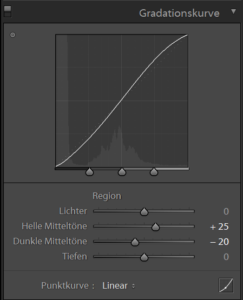
The contrast settings overall were left at 0, but there were some corrections in the tone curve.

(click to enlarge)
Tone Curve. I set the Lights to +25 and the Darks to -20, so a typical S-curve resulted.
And the scaffold?
It was corrected using one simple mask with minimal corrections.

Clarity was set to +25, and Sharpness was set to +30. That’s all.
The final image
After all I exported my image to .jpg.
Please note the fine details within the shadows – they are not completely black – and the huge plasticity of the sky.
I love it. It’s one of my favourites.
Thank you for your comments!
Did you like this image? Your comment in the comment section below is highly appreciated, thank you!
Home
Thank you for reading.
You can sign up for my newsletter here.


