
Caution. This blog post could be highly exciting and interesting or boring dull.

This blog post is about highlights and shadows, brights and darks, pure whites and pure blacks, smooth and strong contrasts and tons of tones. For some people this post will be highly exciting and interesting, for some it will be as boring and dull as ever possible.
You decide if you continue reading 😉
Now – as you clicked “continue reading” I am really glad to giving you an example of one of my beloved images, carefully postprocessed and tonality-adjusted according to Ansel Adams Zone System – at least in a “light version” 😉
As already written in one of my previous blog posts (see here: my personal 100 shades of grey) Ansel Adams’ Zone System assigns all possible tones between black and white to zones – from the purest blacks to the purest whites – whereby the purest black corresponds to zone 0 and the purest white to zone 10.
For better understandig of the Ansel Adams Zone System please see figure 1.
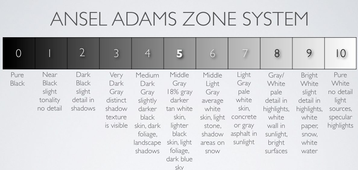
Figure 1. The Ansel Adams Zone System.
Image credit and source copyright © http://lightartacademy.com/blog/tutorials/exposure-zone-system/.
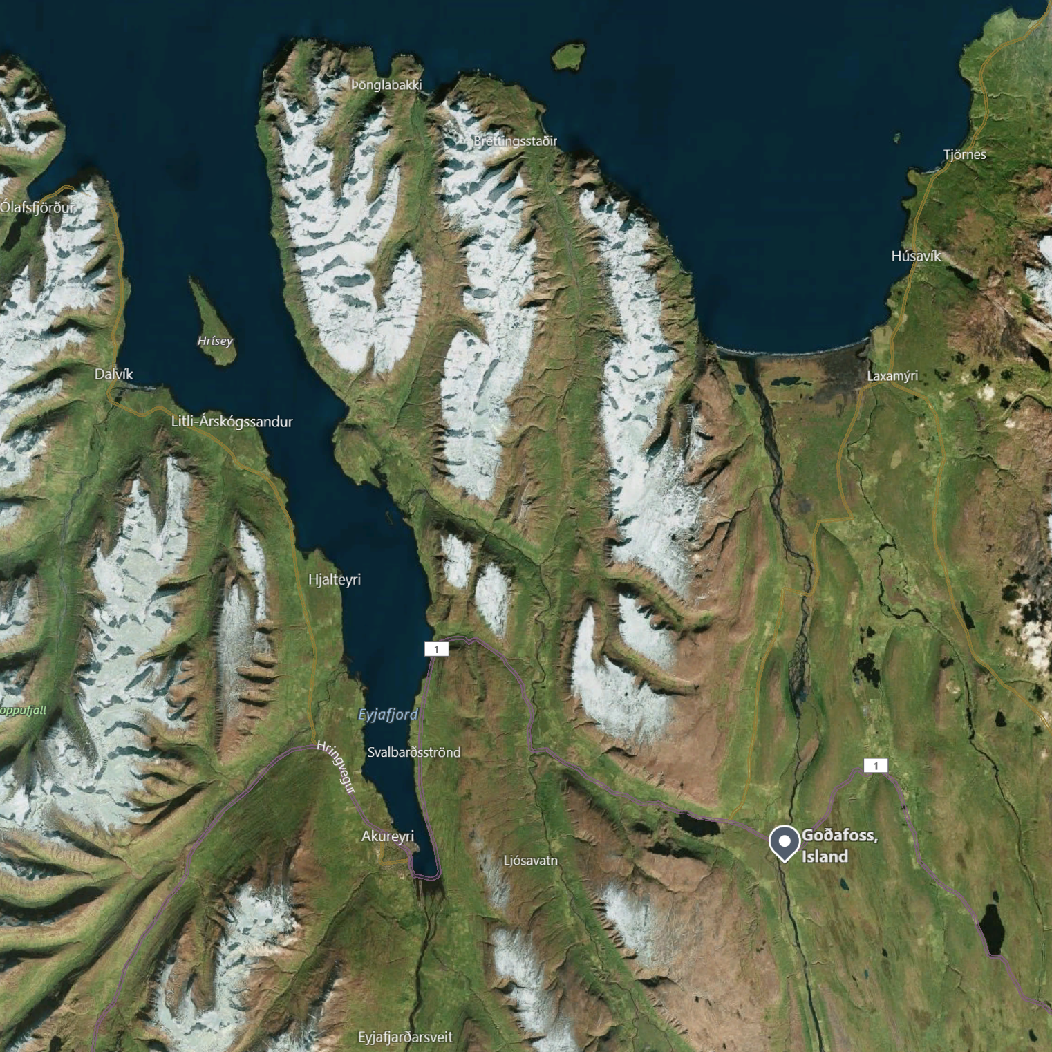
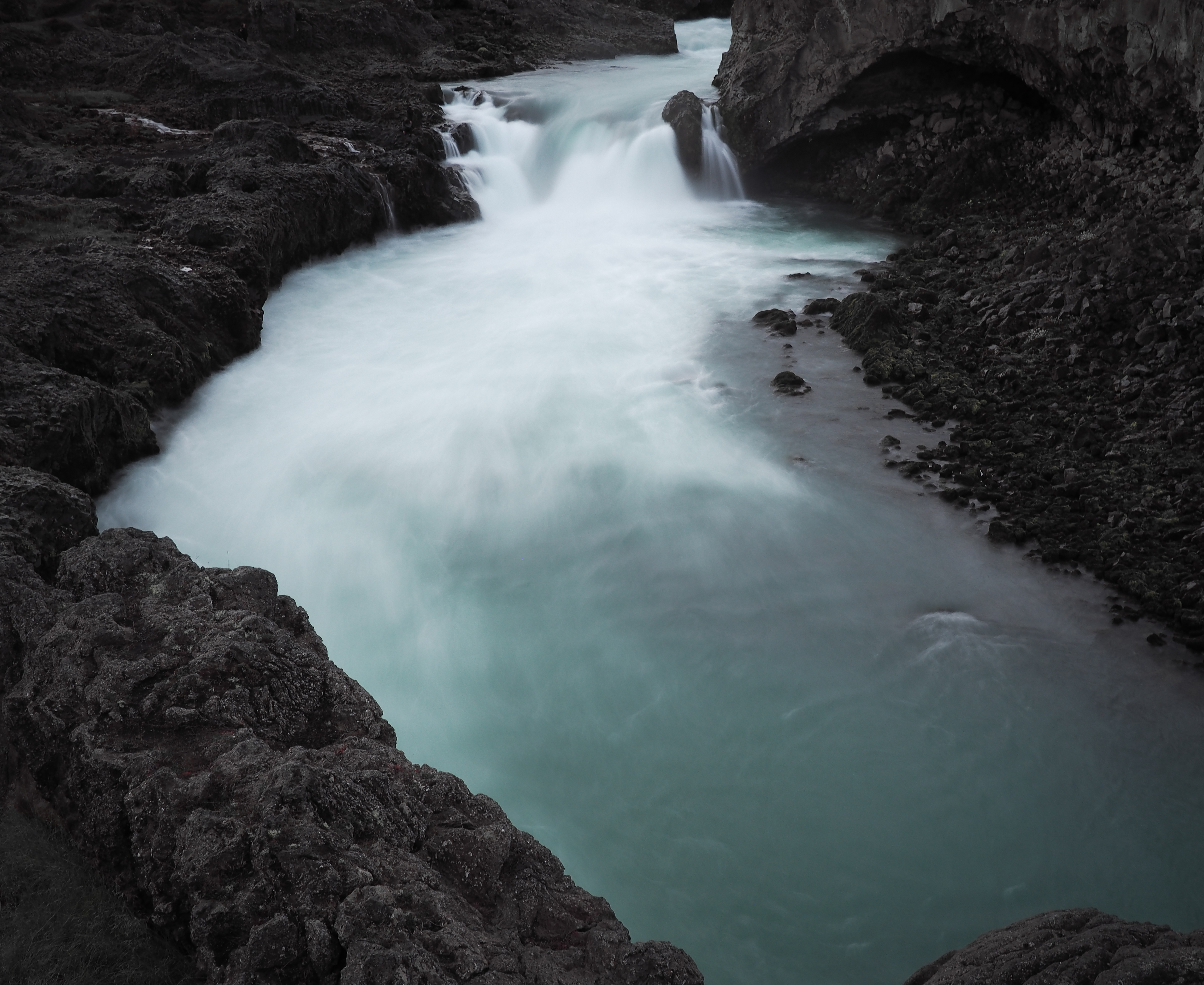
Let me give you a practical example of the richness of tones corresponding to the Ansel Adams Zone System – with an image of Goðafoss (see maps.google.com) – my image shows the small front part of the famous waterfall in Northern Iceland.
© Copyright and Source Microsoft Corporation 2018.
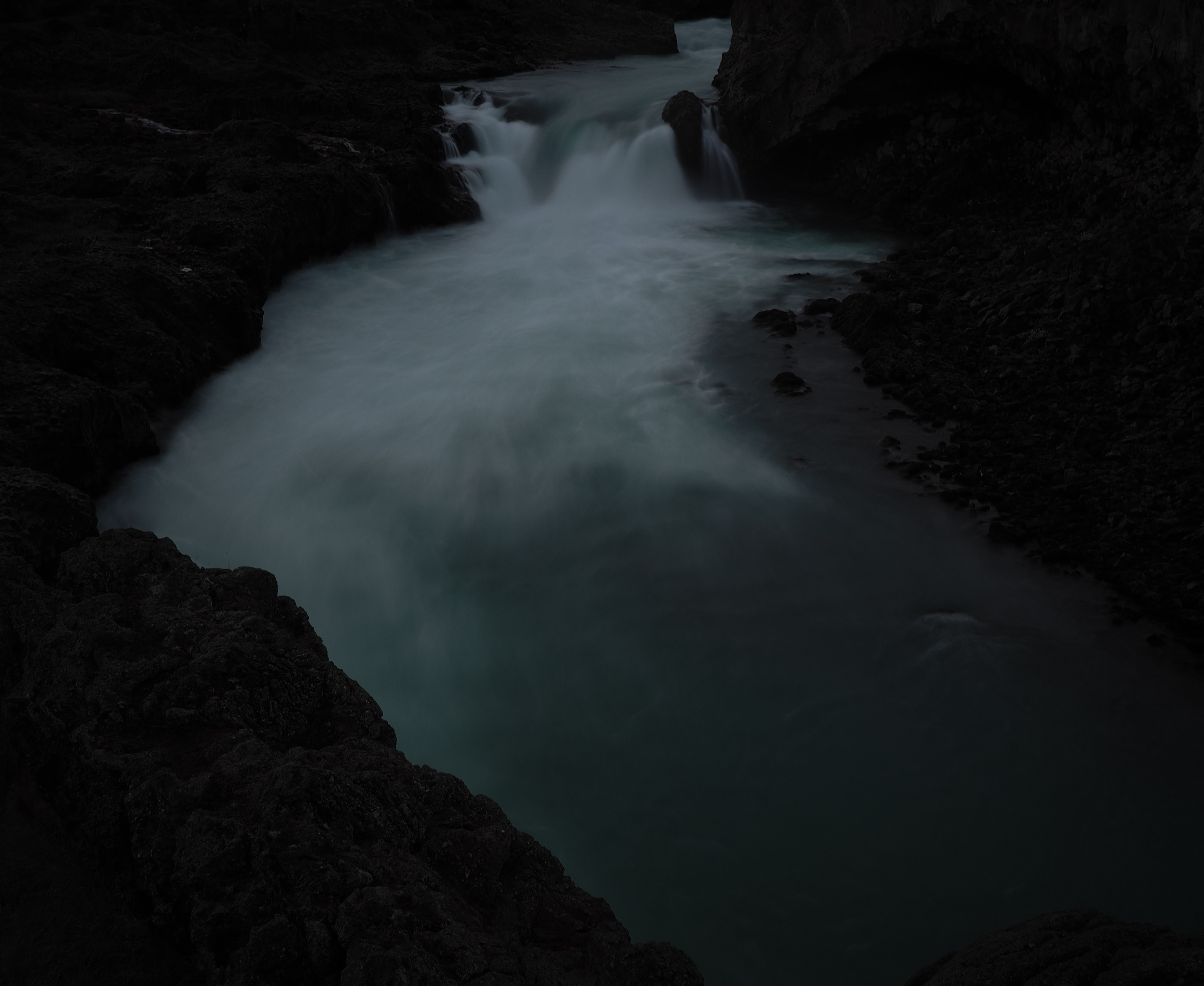
The orginal image
The image was taken from the small pedestrian bridge over the white water a few hundred meters in front of the waterfall.

Original image, it’s the base image for the final processing. The exposure was spot metered right on the brightest white part of the water, and then corrected by +2.0 EV. Hmm – the image is a little bit too dark – at least in my opinion – I should better have corrected it by +2.5 stops (+2.5 EV) – the tones are too dark and it’s contrast is too low. And furthermore … keep in mind that my monitor is not calibrated – it’s just a very good quality and high resolution screen – but not a calibrated one. Having said that – as a disclaimer – let’s continue.
And please. Please. I know your phone’s screen is perfect. But do me a favour, please have a look at the final image on your Mac, iPad Pro, on your Surface Pro, or on your high resolution monitor. In my opinion it’s worth it – and you probably won’t be able to spot the fine differences in the tones just on your phone.
Some of the EXIF data:
Date: Oct-8 2017 11:30 a.m.
Camera: OLYMPUS PEN E-PL7
Lens: Panasonic LUMIX G 20 mm F1.7 ASPH
Filter: Dörr ND 3.0 1000x
Exposure: 2.5 seconds
Aperture: F5.0
The image was converted from RAW (ORF) to a 16bit TIFF file using OLYMPUS Viewer 3 Version 2.3, and finally processed in Adobe Lightroom 5.7.1 (.exe, Windows Version).
Corrections made in OLYMPUS Viewer 3 while converting the ORF file to the TIFF file:
Highlights: -2
Shadows: +2
Sharpness: +1
Details: +1
Corrections made in Adobe Lightroom for the above original base image (i.e. for all of the following images):
Saturation of orange channel: -100
Saturation of yellow channel: -100
Vignetting: -10
Grain: +5
Of course the above steps in Adobe Lightroom are not mandatory, but in this image I preferred the monochromatic style.
Sharpness: No corrections applied (really important!)
Details: No corrections applied (really important!)
Two possible ways to the best exposure
1- During postprocessing. All my corrections in this blog post are made in postprocessing – i.e. based on the original file. This for sure is a possible way to deal with the exposure and contrast – but not the best, because in fact it’s just a correction of the original file – it’s made in the digital darkroom, or better in the lightroom. But keep in mind that making all the corrections in postprocessing could result in possible loss of colours and details in shadows or result in missing details in the brightest parts and given some blownout highlights.
2- During the exposure. This is the better way – in my opinion for sure! – of assigning the right tones to the desired zones (referring to Ansel Adams Zone System). If you are not all sure about the exposure, just make an exposure series while taking the photograph – in order not to miss any of the fine tones and having the best “negatives” – sorry 😉 files with maximum tonality.
Keep your photography slow and expose very very carefully.
I do not need 50 frames a second – I would like to have only one image a day, but a good one.
Step 1: Make an exposure series
Now let us have a look to the exposure series made in post – in Adobe Lightroom 5.7.1 – all images are based on the same original image (see above).

above left: -1.5 EV; middle: -1.0 EV; right: -0.5 EV
above: Original 0.00 EV, base file.


above left: +0.5 EV; middle: +1.0 EV; right: +1.5 EV
Take the first image (see all above, -1.5 EV) as the dark example:
We have got a lot of details in the white water, fine tones – but the tones are too dark and the water tends to a bright grey – instead of beeing white. On the other hand the black lava rocks are really black, missing a lot of details. The overall image is too dark.
Take the latest image (see above +1.5 EV) as the bright example:
We have a very vivid and nearly – if not fully pure white water, lots of fine details within the water are missing. On the other hand the black lava rocks are full of details in the shadows, but the lava is no more black, it rather tends to be grey and a little brown. The overall image is too bright.
Step 2: Assigning and adjusting the tones
In the next step the tones are assigned to the desired zones of the Ansel Adams Zone System:
The brightest whites of the water should be zone 9. The highlights of zone 10 would be without any details, just pure whites, blownout hightlights. I would avoid zone 10!
The darkest blacks of the rocks should be zone 1. Some (but really just a few) parts of the darkest shadows could be in zone 0 (i.e. without any visible details – pure black).
As a base file we take the original file with 0.0 EV.
In Adobe Lightroom the following corrections are applied:
1- Highlights: Should be zone 9: In my case set to +80, i.e. about +1.25 EV.
2- Bright middle tones: Should be within zone 3 and zone 4: No correction.
3- Dark middle tones: Should be within zone 2 and zone 3. No correction.
4- Shadows: Should be zone 1. In my case set to +40, i.e. about +1.0 EV.
The above corrections are rather typical for my OLYMPUS raw files – in my opinion my PEN E-PL7 files tend to lack a lot of details in the shadows, while on the other hand they often have blownout highlights – but – and this is perfect! – not in the above example, where the original file was underexposed. In general this is the reason I often underexpose my images using my OLYMPUS PEN E-PL7 by 1/3 or 2/3 EV, exposing straight to the highlights. This results in too dark images, but recovering a certain amount of shadows is much easier than recovering blownout highlights – which is impossible.
“Beta”, “Release Candidate”
Here is the result after the above corrections; in addition I corrected the overall exposure by +0.25 EV – the image still was a little bit too dark.
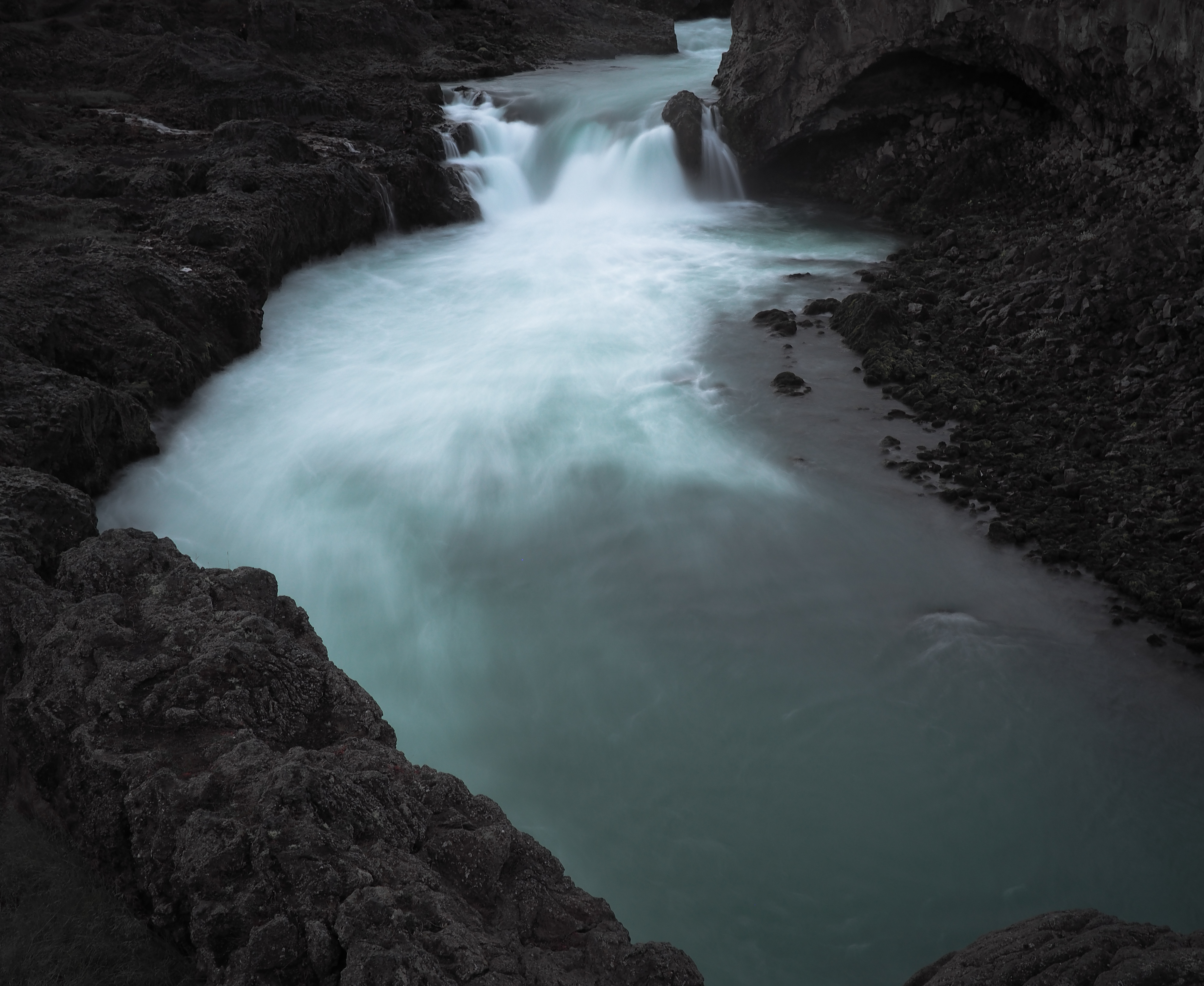
Base file + (highlights +80, + shadows +20, overall exposure +0.25)
Step 3: Final image
In order to give the final image a “little more punch” I corrected the presence and clarity in Adobe Lightroom by +20. And here is the final image, exported to .jpeg.
Base file + (highlights +80, shadows +20, overall exposure +0.25, clarity +20)
Conclusion and cookbook
Let me just sum it up as a short conclusion. How to get the tones you want?
Step 1: Make an exposure series. If this is not possible or you forgot make the exposure series in your postprocessing tool, for example in Adobe Lightroom.
Step 2: Choose the best image of the series – containing a lot of fine details in the shadows and (this is even more important!) with no blownout highlights.
In other words:
– Avoid zone 0 – unless you want to shoot low key.
– Avoid zone 10 – unless you want to shoot high key.
Modern mirrorless cameras will indicate shadows without any details and blownout highlights (highlight “blinkies”), this could help you with the exposure.
Step 3: Assign the highlights to the according zones. In my case – taking an image with white water – the brightest parts of the water should be assigned to zone 9 and the darkest parts of the volcanic lava should be assigned to zone 1. Again: Avoid zone 0 and zone 10. If there are clouds or snow covered mountains, be very careful with those whites – there shouldn’t be any tones in zone 10. Of course my advice is just a general one and very subjective – feel free to overexpose or underexpose according to your artistic style and needs. I do so as well in some cases.
Step 4: Adjust the overall exposure, the middle tones, the bright shadows and the dark shadows.
Step 5: Finally adjust the presence – in my case the clarity (+20) according to your needs.
Final thoughts
You can use any camera for fine art images. You do not need one of the flagship models – even if using your smartphone (in manual photo mode) you can take fine art images. Take me for an example: I am using an old OLYMPUS PEN E-PL7, the entry level camera of the PEN series, with only a very limited dynamic range. See DxOMark.com for your camera’s dynamic range. If you own a camera with rather low dynamic range (as I do) you simply have to be more careful with your exposure.
And one final thought – but this is my personal opinion: I do not like any of those exaggerating and in most cases very overtuned HDR effects. Of course you could get much more dynamic range using HDR, but it’s up to you – I simply do not like it at all.
And now – your opinion?
In my final image, I am still not all happy with the middle tones: Should they be darker? What do you think? And what is your general opinion about my image?
Please leave me your comments below – I really appreciate it!
Thank you.
Home
Thank you for reading.
You can sign up for my newsletter here.

Danke! Toller, interessanter und spannender Artikel! Und dank unserem Gespräch heute Abend habe ich sogar noch besser verstanden! 😉
Ich bin zufrieden mit deinem Final image. Für mich stimmt es so, es sollte nicht dunkler sein. Und die clarity macht sich sehr gut!
Freue mich auf den nächsten Info-Blog und auch sonst deine schönen Bilder.
Danke! In einem der nächsten Blogartikel werde ich die Hauptmerkmale und -Vorteile des Zonensystems erklären.