I am an old black & white lover.
No – in fact that’s not strictly correct – beside the pure blacks and whites I even care more about the subtle tones in between – at least as much if not more than for the brightest whites and the darkest blacks. All those tones are my personal 100 shades of grey.
According to Ansel Adams Zone System from 1930, the brightest whites correspond to Zone 10 and the darkest pure blacks to Zone 0. Your camera’s light meter is adjusted to the middle – to Zone 5 – this corresponds to the standard Kodak™ 18% neutral grey card – which is (in my opinion at least) a rather dark grey – exactly in the middle between pure white and pure black. If you take a picture of white snow the snow will tend to be much to dark – because your light meter will always try to adjust the cameras exposure to Zone 5 – to the average, that’s why your image of the white snow will get rather dark – exactly on Zone 5 – and you will have to overexpose your image to get the real white of the snow.
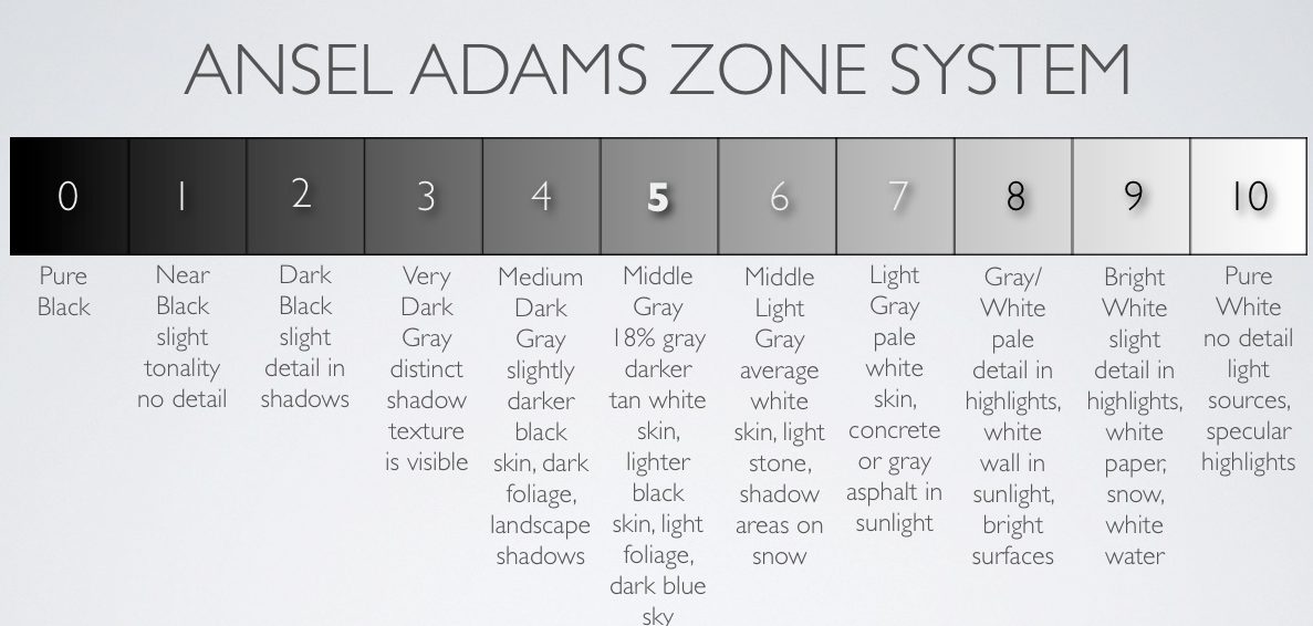 The Ansel Adams Zone System. Image credit and source (c) http://lightartacademy.com/blog/tutorials/exposure-zone-system/, highly recommended for reading.
In my photographic career beginning in the 1980’s analogue black & white film days I read a lot about Ansel Adam’s Zone System – actively practicing it – shooting very carefully frame after frame, continuously learning from film roll to film roll, getting better and better in metering and exposing. My cameras and my darkroom were in constant use, I shot Kodak™ Technical Pan 2415 (.pdf) – an ultrasharp, and very demanding (i.e. difficult) film mainly for documentary purposes, but with some care, and correctly developed for soft tones it delivered perfect tonality, and was true panchromatic – then, because of the higher ISO sensitivity I switched to Ilford FP4 and Ilford FP4 Plus, and finally ended up with the much beloved Adox CHS 100 and Fomapan 100 – constantly improving my skills in light metering to proactively predict the tonality of the final image even before taking it. In those days back I learned how to expose correctly, how to push or pull some film sensitivity during their development in my darkroom and how to control their contrasts, tones, highlights and shadows by using the appropriate development. I would never want to miss that privilege to have shot analogue film!
Beginning with a Nikon FE and Nikon FE2 camera and several prime lenses, I soon fell in love with medium format, Pentax 6×7 and Pentax 67, then upgraded to a less bulkier and somewhat more lightweight package – to the fantastic Mamiya 7 ii – the best analogue leaf shutter rangefinder film camera I ever used, with the ultra crisp 80mm F4 lens – and finally got the honor to shoot with an old Hasselblad 500 C/M. I still own all of those film cameras today. What a fortune! Those fantastic old days!
But, believe me – I am not getting old 😉 – still feeling fit! – today’s modern digital cameras are as fantastic as well – no, they are even better by far – if we stop pixelpeeping, start thinking about colors and forms instead of autofocus speed and try to obtain the same old mystic and rich tonality of the analogue film emulsions.
Let me give you some examples.
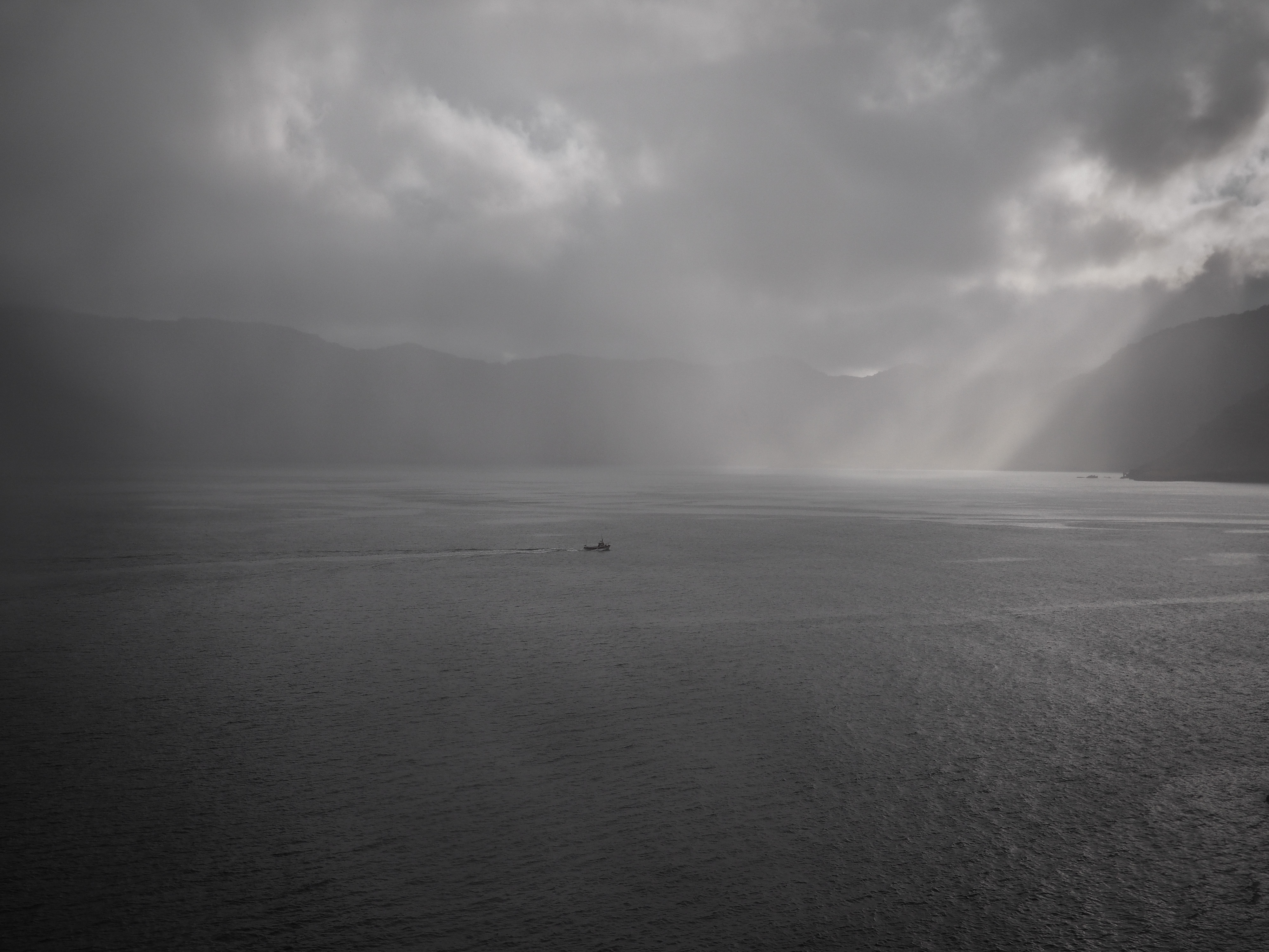
During my latest trip to Iceland in 2017 I didn’t try to avoid bad weather conditions – as most of the tourists do – no, instead of waiting for blue skies and colorful landscapes I often headed out to the stormy rain, trying to capture the dramatic and the continuously changing arctic light.
Here are some of my photographs.
All those images are shot with an simple, beginners style and fashionlovers Olympus PEN E-PL7, most of them with my favourite lens – the Lumix G 20mm F1.7 ASPH II. I hardly ever change it – if you want so I use my PEN as a fixed lens camera 😉
All images were shot in RAW format (ORF); the dark shadows are lifted up by 2 stops and the brights are lowered by 2 stops; some minor sharpening and enhancing the details was applied. Finally all images were RAW-converted in Olympus Viewer 3 to a high resolution 16bit TIFF file.
At least all images were postprocessed in Adobe Lightroom 5.7 (see link to Adobe Lightroom 6) – adjusting mainly the subtle tones and enhancing the dramatic light a little by some masks, but leaving sharpness and details untouched.

Just after the sunset. Dramatic light conditions and nearly black shadows.
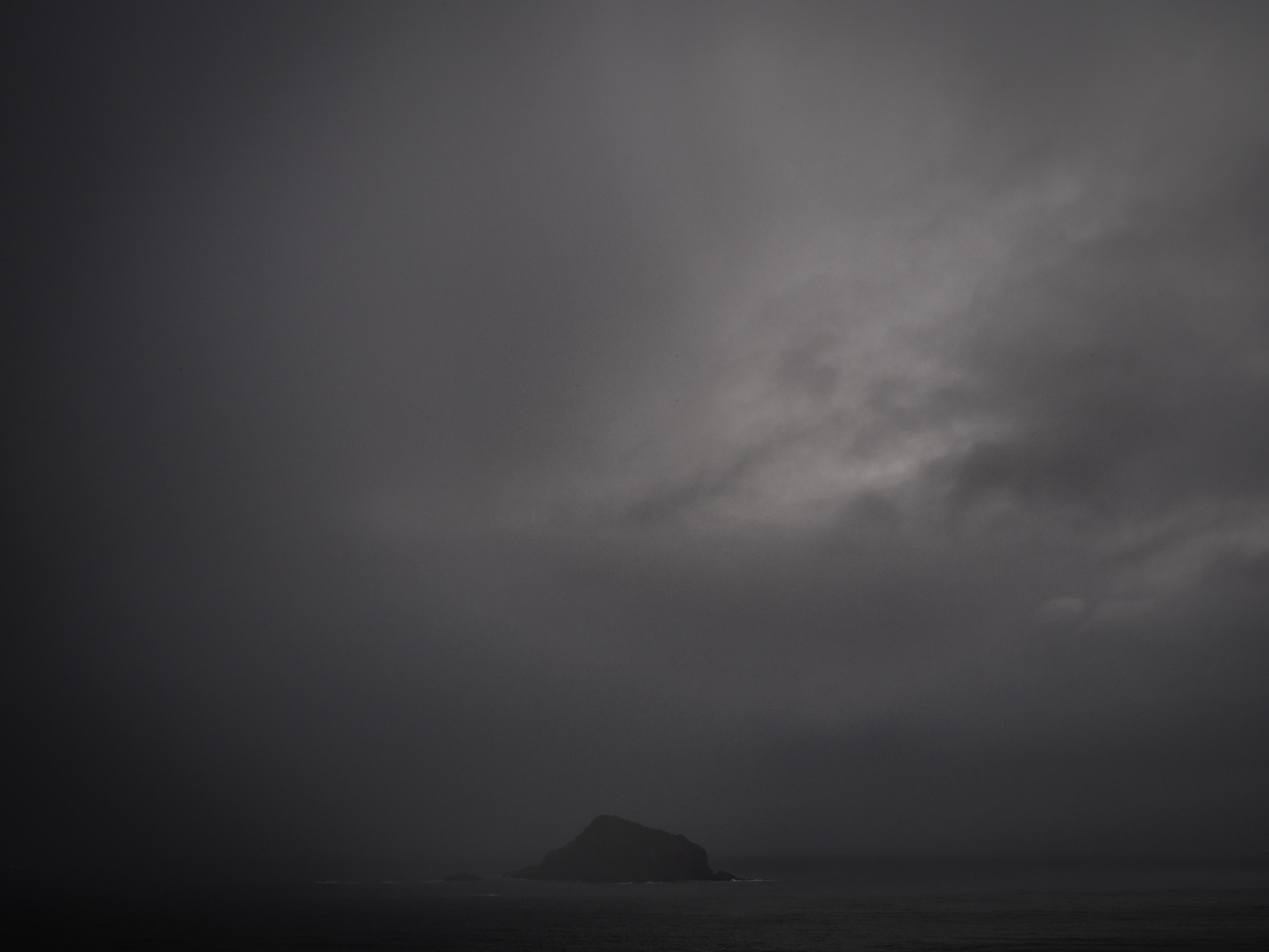 There is no bad weather at all. I always carry a roll of transparent plastic bags with me – just in case it gets really wet.
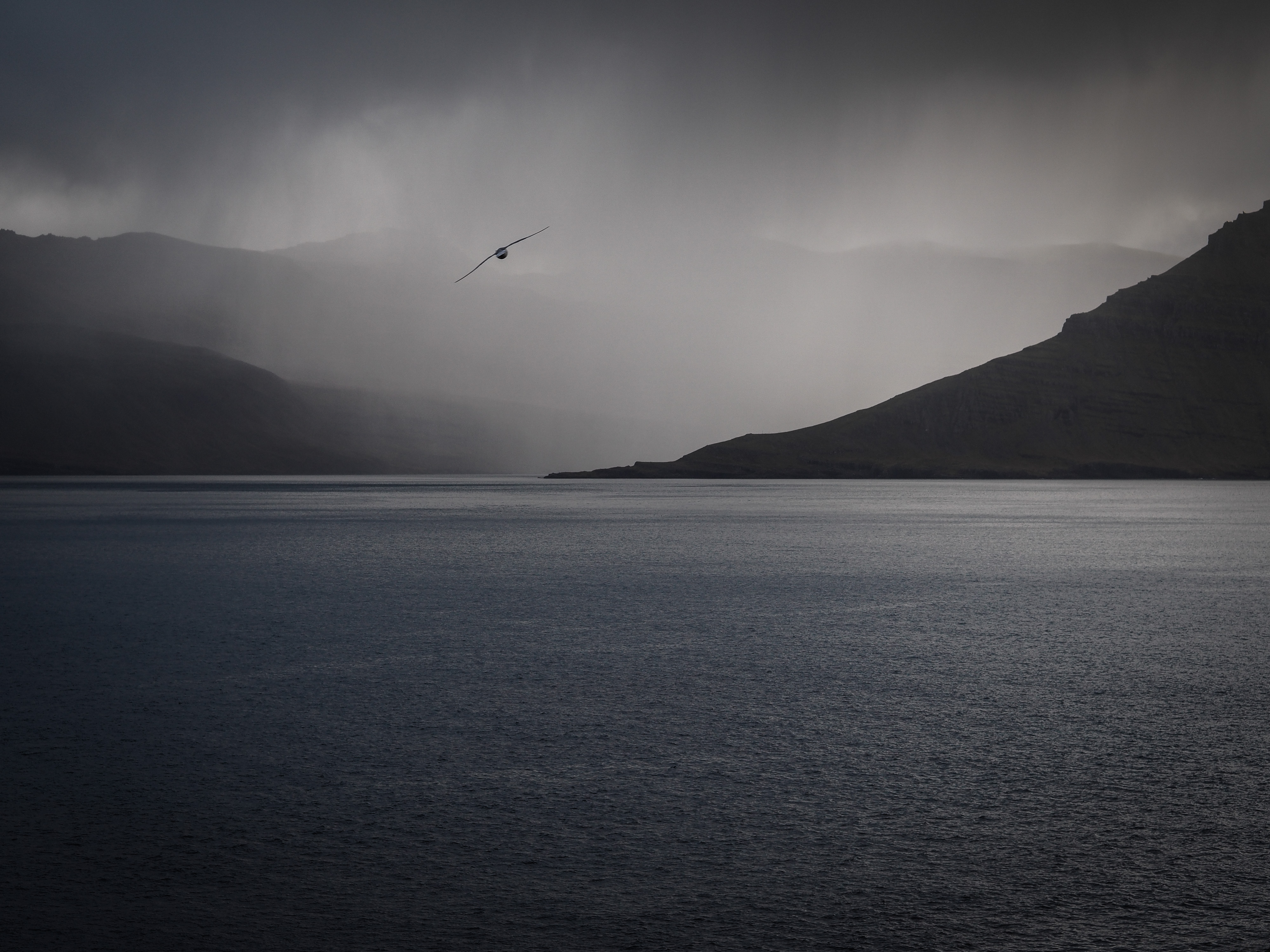
One of my favourite images – I love the subtle blue of the ocean in combination with the upcoming dark storm and rainy sky, held in warm greys and blacks. The seagull was just flying by – as if it knew it will be my perfect foreground.
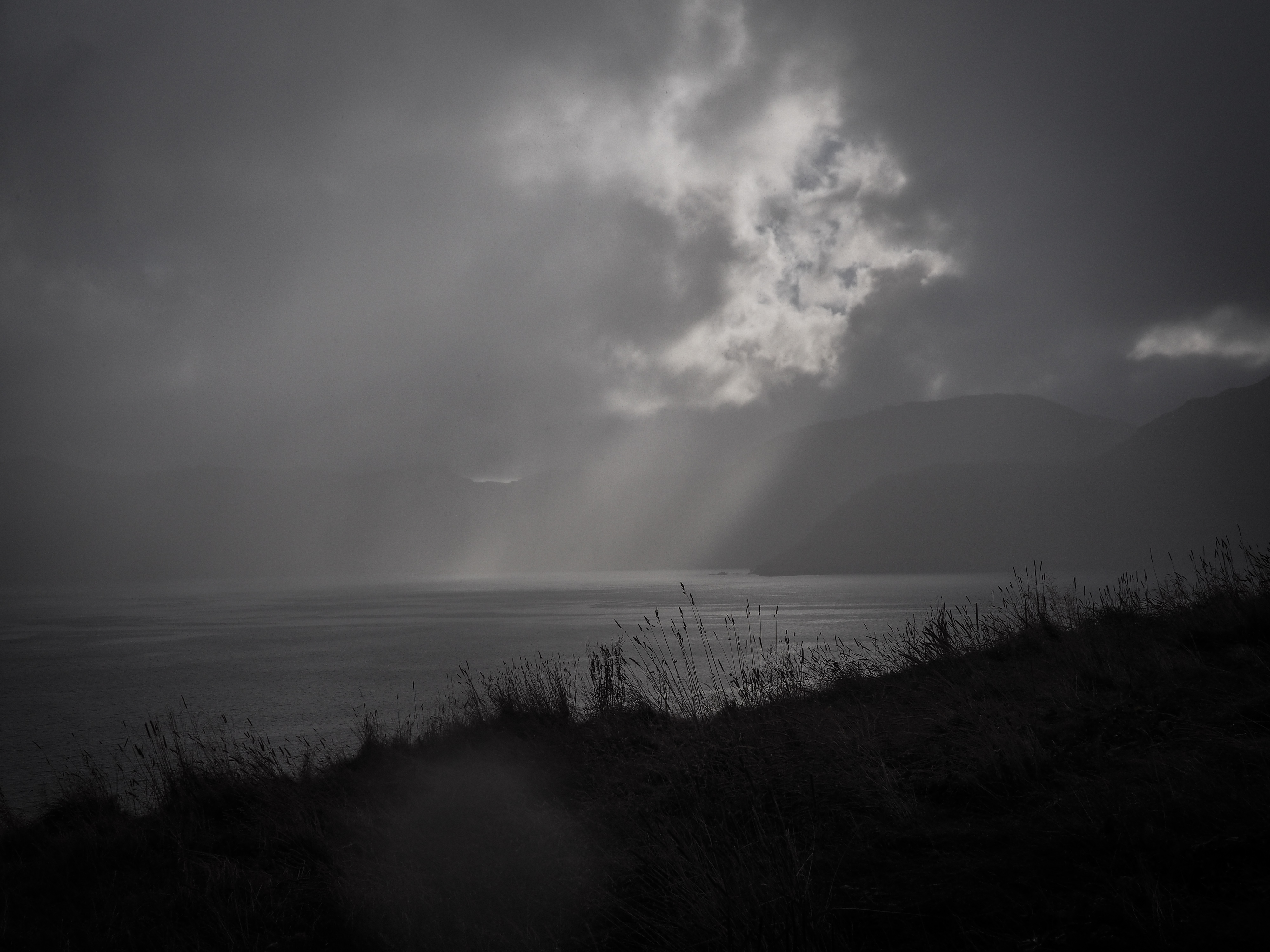
I never stop taking pictures – not even in the rain. My Olympus PEN E-PL7 is not weather sealed. Never – mmh, wait, to be honest – just once I had a problem with the rain. One time my Olympus PEN E-PL7 needed an ‘extended drying session’ to get rid of all that fog and mist inside … 😉 near Vík í Mýrdal in Iceland – that was a few years ago. It survived. And the pictures looked great. It was pretty worth getting wet 😉 .
Home
Thank you for reading.
You can sign up for my newsletter here.



Ich han din Blog zwar ned gläse aber Bilder agluegt hani. Sie sind mega schön!
Danke Olivia. Super, dass dir d’Bilder g’falled.
Ich habe ihn auch gelesen und es war sehr interessant! Habe sogar auch etwas gelernt. 😉
Und die Bilder sind toll, mystisch und spannend. Sehr schön! Danke für’s teilen!
Danke!
Oh! Thats a long blog! But i like the pictures, that dramatic art… Yes its really nice! But the best thing in this blog are your words; I never stop taking pictures – not even in the rain. ❤️
Thank you Cécile, you are right – all the more in the rain or before and after a storm lightning conditions can be dramatic. Yes, never stop taking pictures.