Some photographic thoughts about contrasts, highlights and shadows.
Many modern contemporary fine art street photographs and cityscape photographs are characterized by strong contrasts between the deepest shadows and the brightest highlights – which makes them very attractive in common. Pure black shadows and pure white highlights predominate – in between there is only a small range of greytones; contrasts are high.
Ansel Adams’ style on the other hand was strongly focused on rich tonal range – plenty of subtle nuances from the deepest shadows over fine modulated greys up to the brightest highlights – all across the 11 zones of the Zone System. He used black and white film and fine art baryta paper containing a lot of silver, which gave him maximum tonality. Ansel Adams often avoided zone 0 (deepest black) and zone 10 (brightest white). Further information about Ansel Adams’ Zone System please see in my blog posts here and here.
Develop and keep your own style
However there is certainly no need to follow one specific style over the other – better develop and keep your own style – do not be like Ansel Adams! – but nevertheless it is interesting to have a short comparison on the effects of brightening and darkening the shadows – comparing fine shadow details to deep blacks.
Short comparison with two photographs
With two of my favourite photographs of modern cityscapes I would like to show the effects of brightening and darkening the shadows. Both photographs were taken in April 2018 in Zurich, Switzerland.
My Ricoh GR II – I love it – it’s a true little beast with fantastic image quality! – is well known for it’s high dynamic range and produces perfectly structured and fine detailed DNG RAW files. The files were postprocessed from DNG RAW to .jpg in Adobe Photoshop Lightroom.

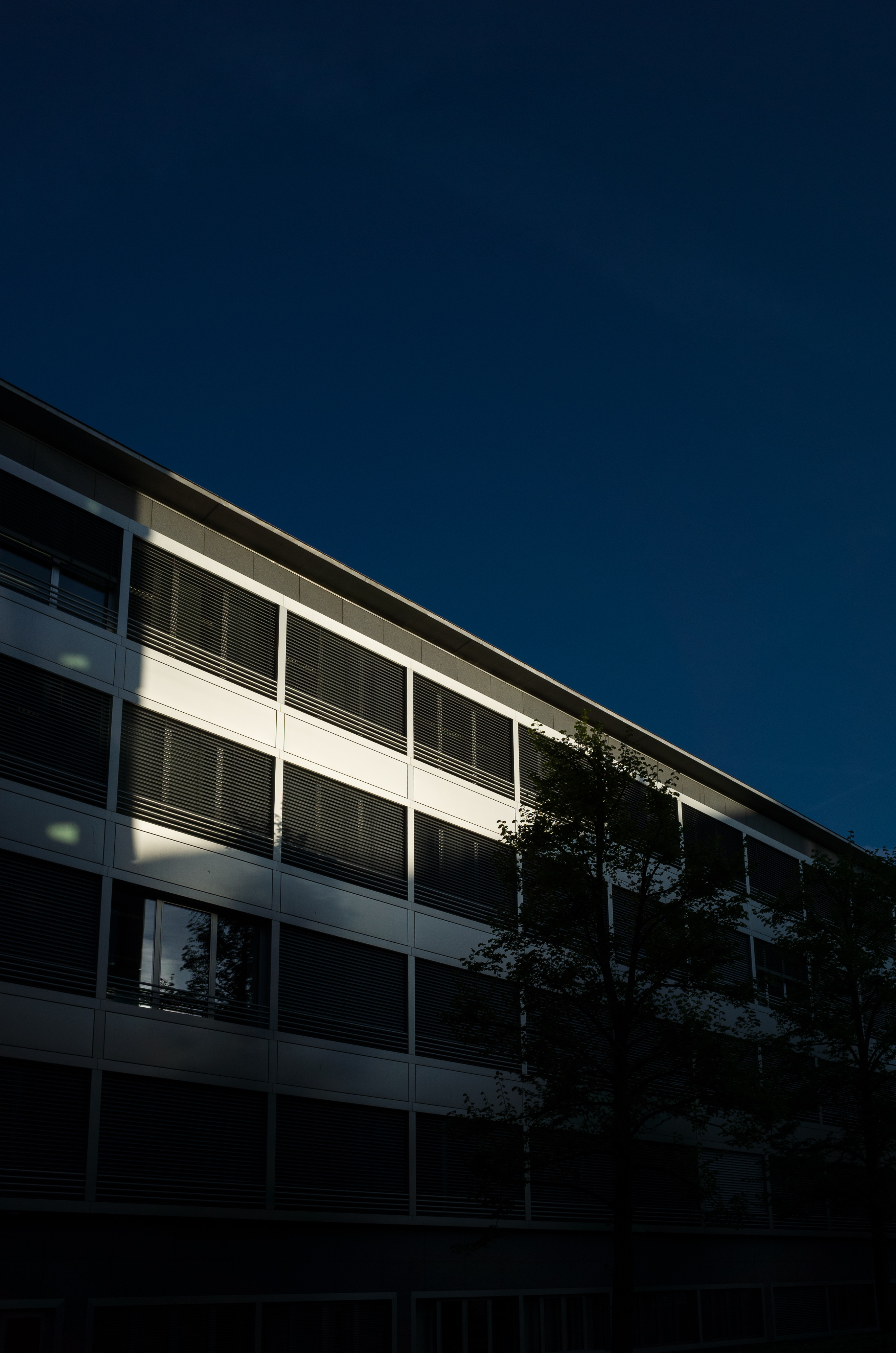
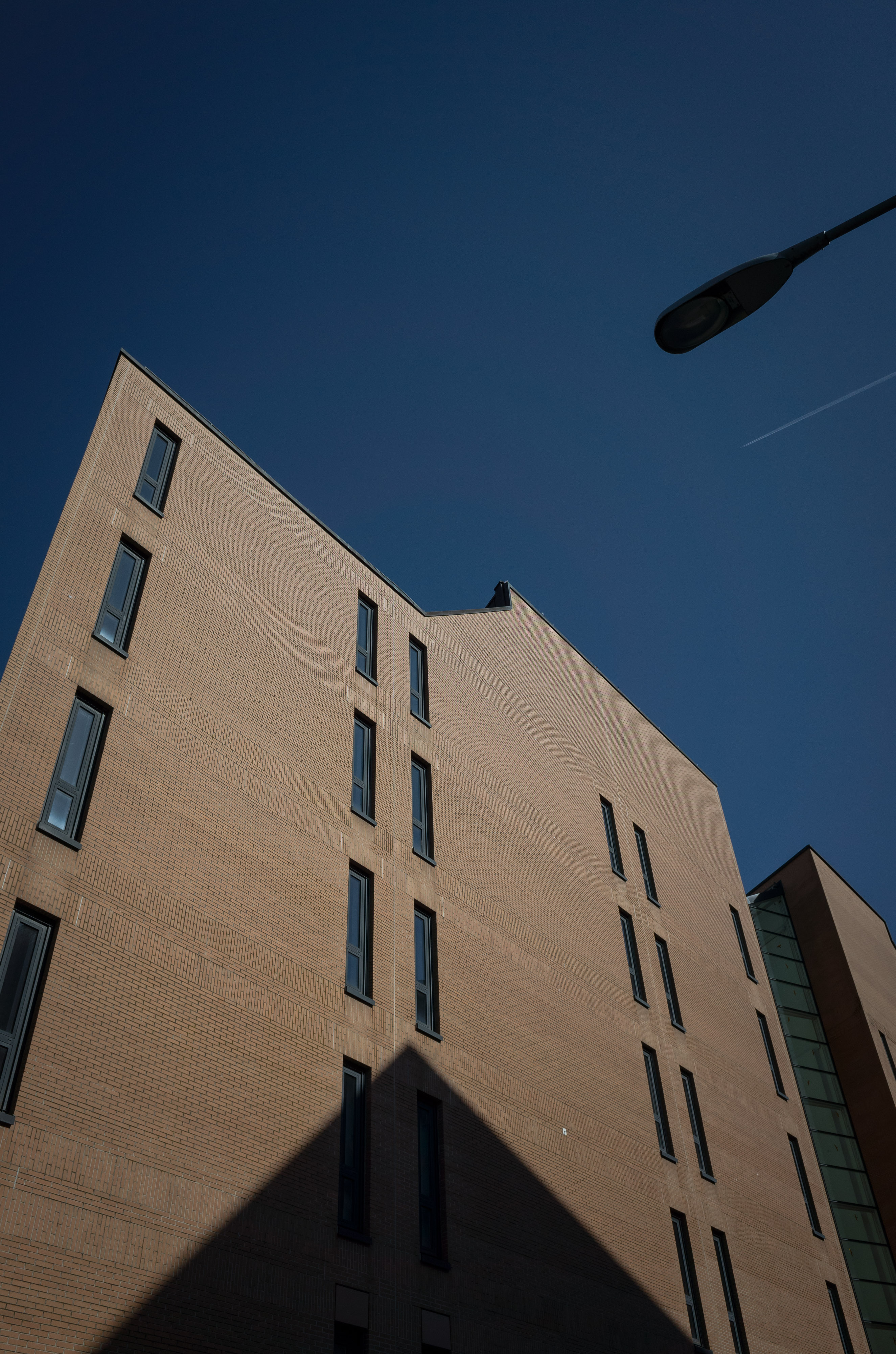
Photograph 1-
Orange bricks and dark shadows, postprocessed in Adobe Photoshop Lightroom from DNG RAW;
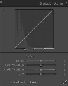
0 Highlights, 0 Lights, 0 Darks, 0 Shadows (see Adobe Photoshop Lightroom tone curve below).
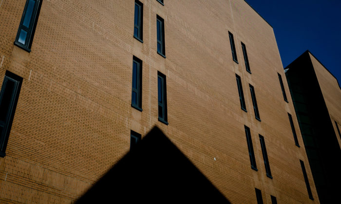
Photograph 2-
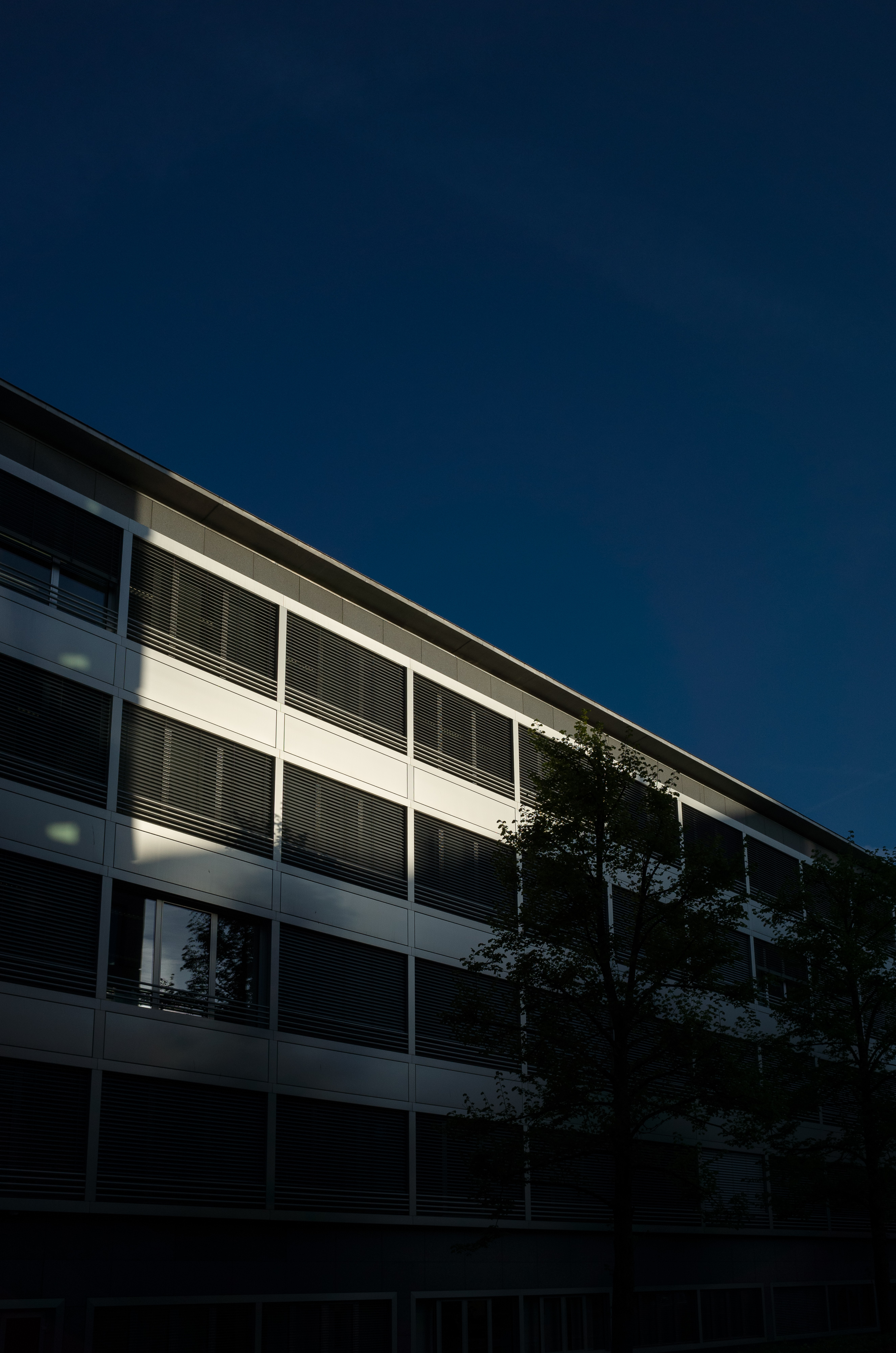
Brushed aluminium in bright sun, postprocessed in Adobe Photoshop Lightroom from DNG RAW;
0 Highlights, 0 Lights, 0 Darks, 0 Shadows (see Adobe Photoshop Lightroom tone curve below).
Brightening the shadows
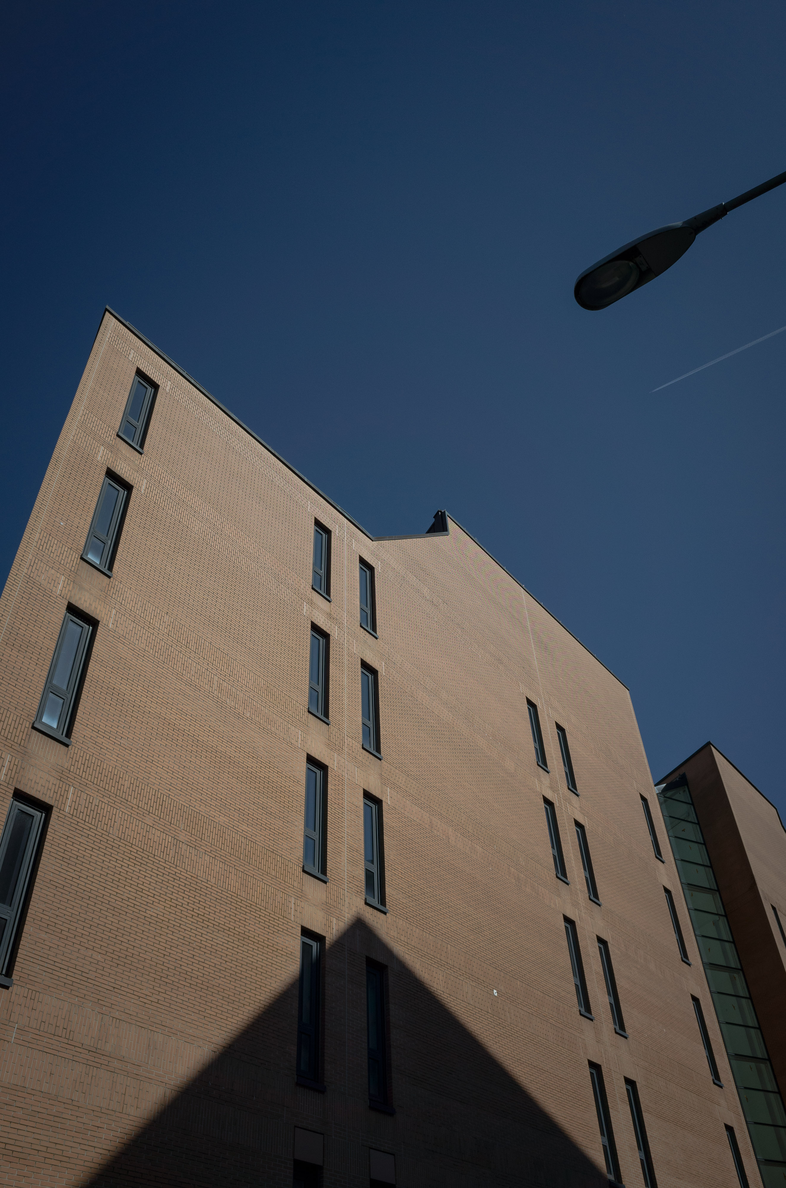
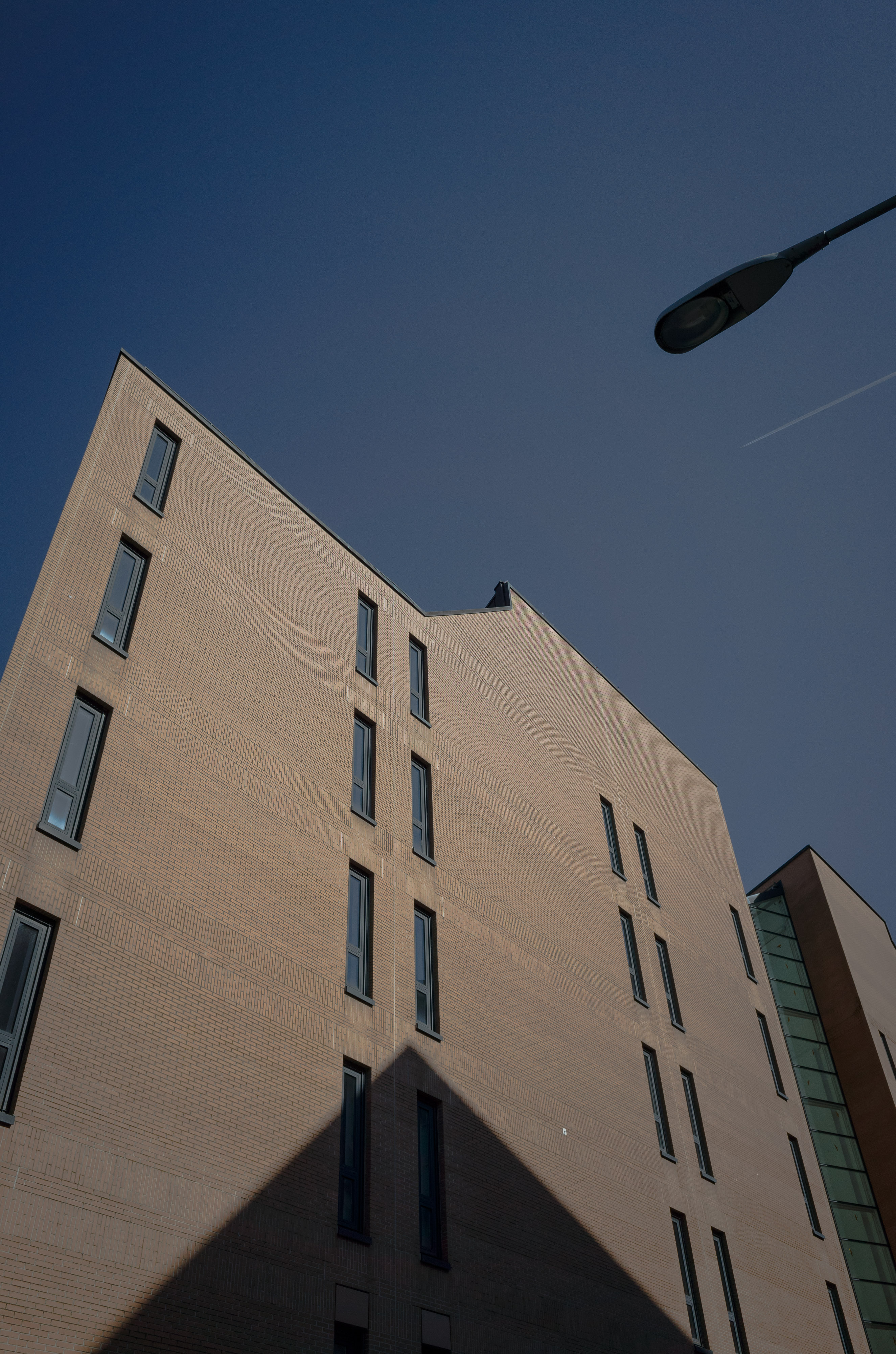
What happens, if the shadows are brightened?
Brightening the shadows from left to right by 20%, starting (left) with Highlights 0, Lights 0, Darks 0, Shadows 0 ending (right) with Highlights 0, Lights 0, Darks 0, Shadows +100.
Darkening the shadows
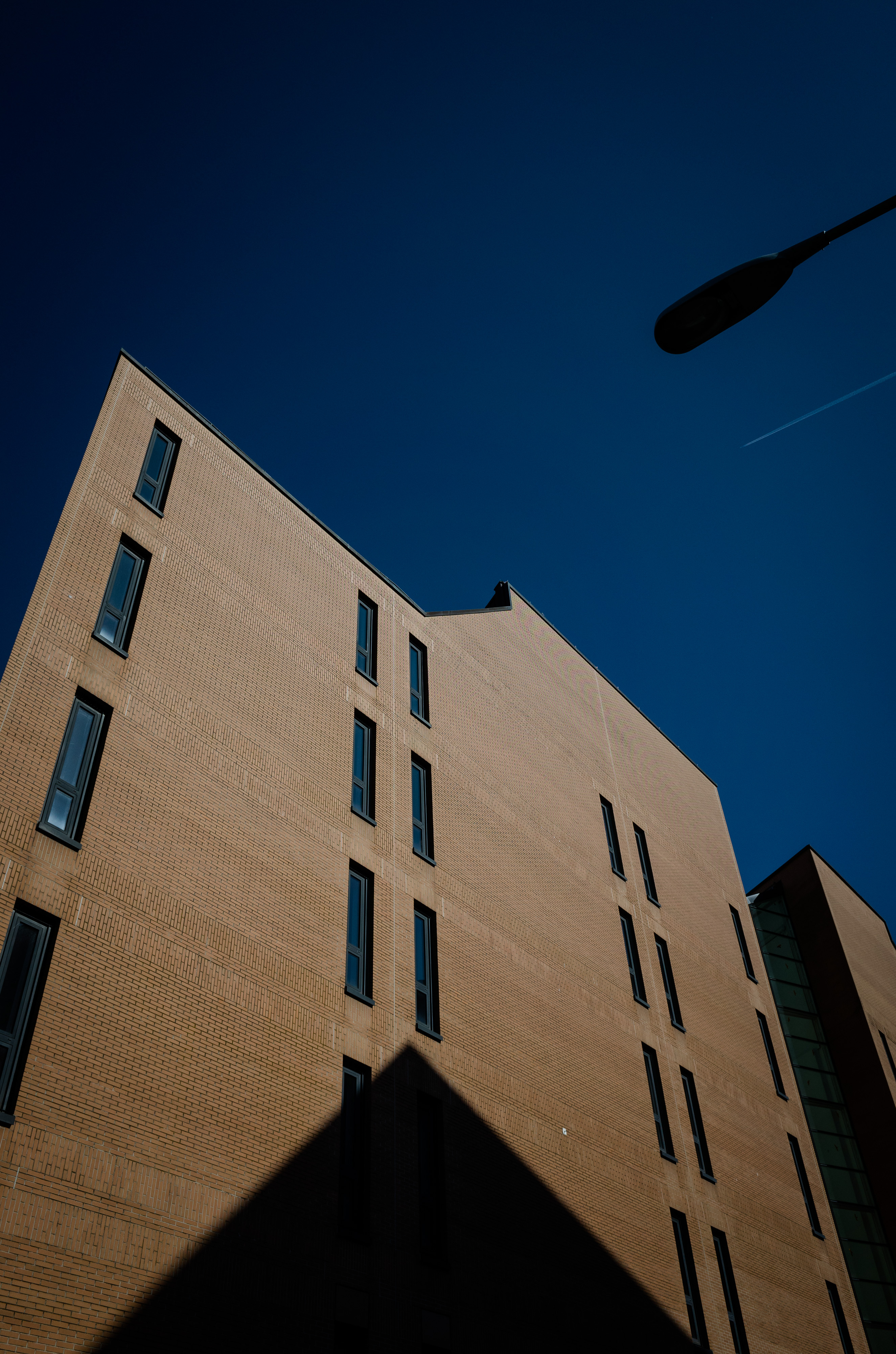
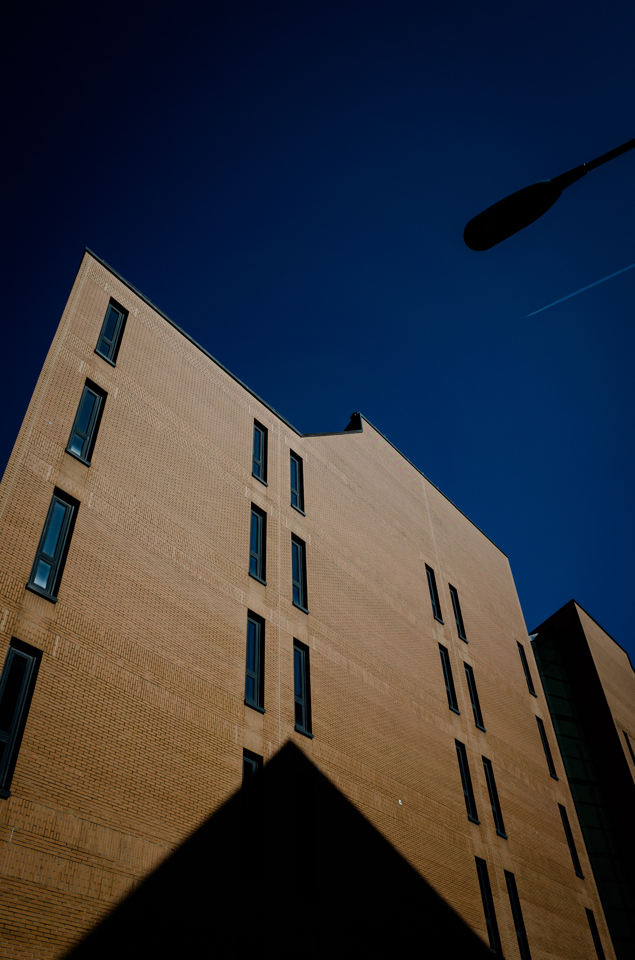
What happens, if the shadows are darkened?
Darkening the shadows from left to right by 20%, starting (left) with Highlights 0, Lights 0, Darks 0, Shadows 0 and ending (right) with Highlights 0, Lights 0, Darks 0, Shadows -100.
Increasing and decreasing contrast in the midtones
What happens, if the midtones – i.e. the lights and shadows are increased or decreased without touching the highlights and shadows?
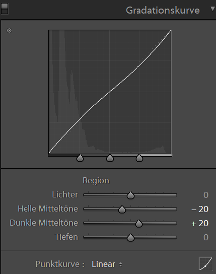
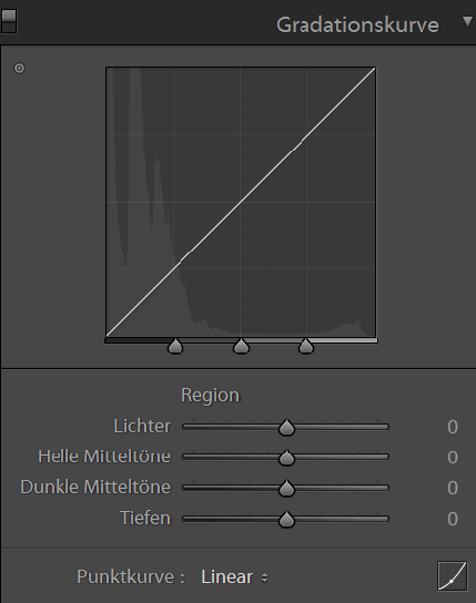
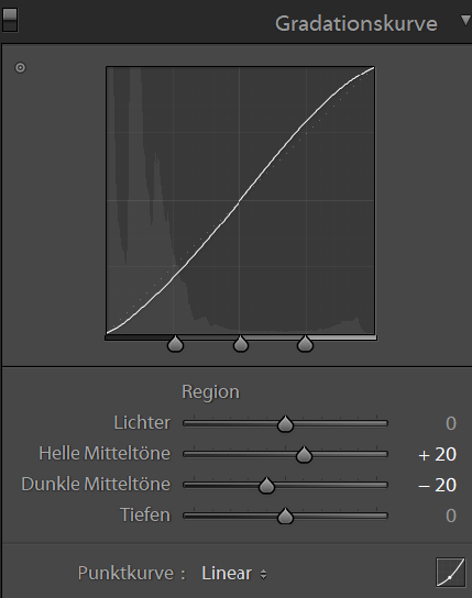
Tonal S-curve
Can you see the slight ‘S’ form of the tonal curve? This is called the tonal S-curve. Contrasts in the midtones are accordingly increased or decreased.
Tonal S-curve; (left) decreasing contrast in the midtones; (middle) neutral and linear tonal curve; (right) increasing contrast in the midtones.
No perfect style but your own
Which photograph looks the best in your eyes?
In my opinion there is no winner between those photographic styles – anyway there is no perfect style but your own style. I for myself prefer rather strong contrasts and fine detailed shadows and low tones, which sometimes is rather difficult to achieve.
Let me know your opinion
What is your favourite style? and which photograph do you like most?
Thank you for your comment – I really appreciate it!
Home
Thank you for reading.
You can sign up for my newsletter here.








Cool, die ganze Sache!
Brightening the shadows: nicht so mein Stil. Jedenfalls bei diesem Backsteingebäude nicht.
Darkening the shadows: Ja, das darf es gerne sein. Für mich sogar -60. Noch tiefer hat es dann, für mich, zu viele schwarze Stellen.
Bei der Alu-Fassade gefällt mir das Mittlere am besten.
Danke für dein Feedback. Darkening the Shadows scheint voll im Zeitgeist – viele Street Photography und Cityscape Photography Fotografen arbeiten zunehmend mit harten Kontrasten. Danke für’s Lesen und deinen Kommentar!