
Yesterday I’ve been to Berne for a coaching lesson – and as always I was quite early and therefore had plenty of time to enjoy my two french croissants and to discover our small capital. Here are some of my images of the main station of Berne in the early morning sun.
I am still not sure which image looks best to me. What do you think – which one do you like most? I am curious to hear your opinion. Thank you a lot!
Early morning light. Berne, Switzerland, at the main station. 2018 June-19, 7 a.m.
RICOH GR II, 18.3 mm. Edited in Adobe Lightroom.
w and w/o color corrections
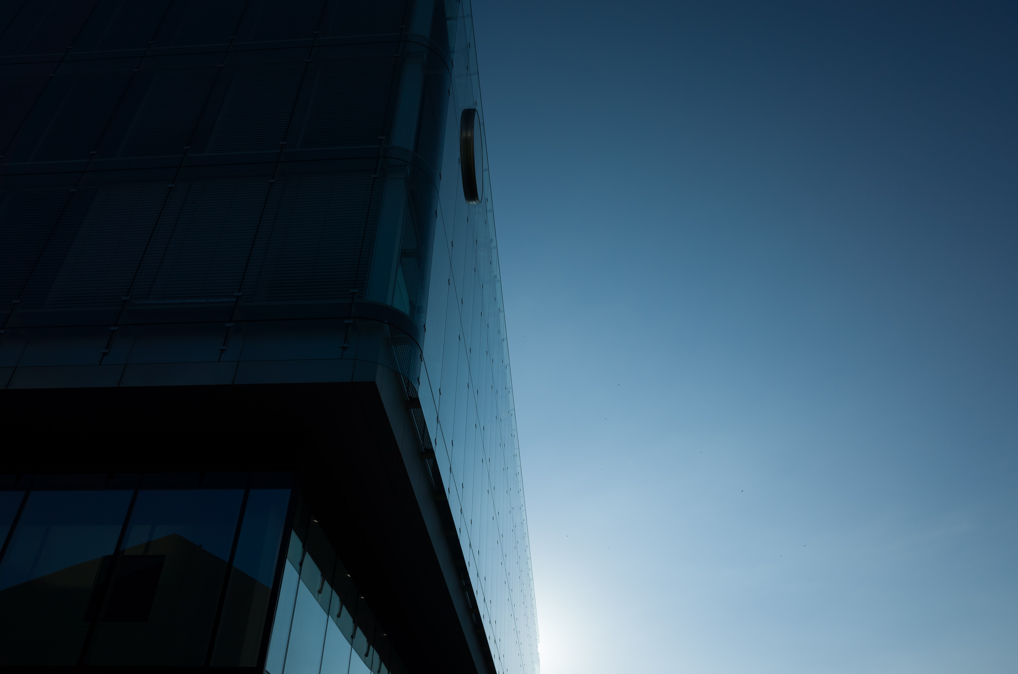
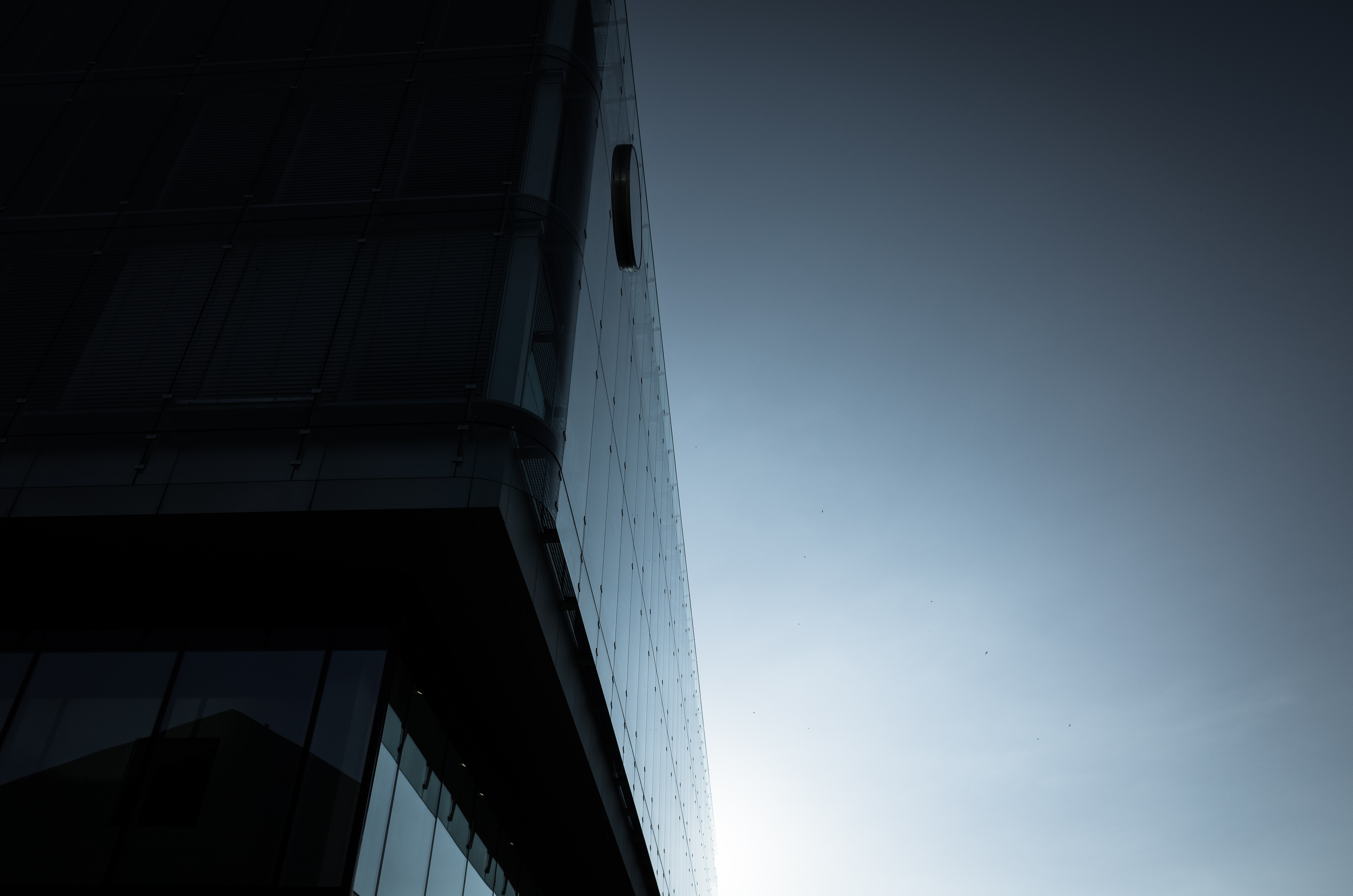
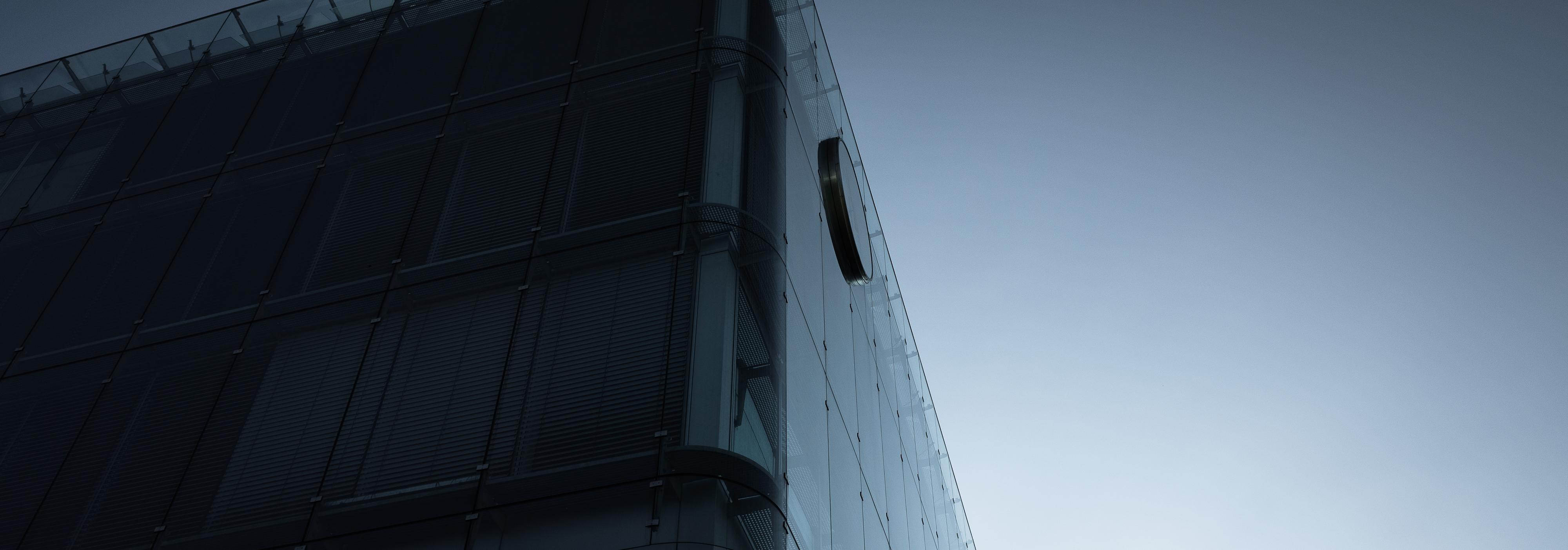
Image 1. No color correction. Original.
Image 2. Color corrected. Desaturated blue to -60.
The same two images once more.
Image 1. No color correction. Original.
Image 2. Color corrected, desaturated blue to -60.
And the perspective?
Beside the color corrections I tried out some corrections of perspective as well. Maybe I exaggerated a little, which one is better? My personal opinion and lesson learned: Be careful with the Upright Feature in Adobe Lightroom – just a slight overcorrection gives a very unnatural look – hmm …


Image 3. Upright Vertical 100%.
Image 4. No correction.
Here are the two images again in full size.
Image 3: Upright Vertical 100%.
Image 4. No correction.
Now. Which one do you like most – and why?
Please let me know your opinion in the comments below.
Thank you a lot!
Home
Thank you for reading.
You can sign up for my newsletter here.
